Category Archives: paper crafts

Style Review aka S.H.O LOAD blog hop

Welcome blog-hoppers to the land of random posts, and too long videos!

Ha.

Sorry. I’ve been staring at iMovie all evening, and I think it’s made me a bit loopy.

If you’re blog-hopping, you should have just come from Alison C.’s blog. If you’re starting here, don’t forget to check out everyone else’s blogs.

Lynnette
Leslie
Katrina
Kelli P.
Alison D.
Cathy H.
Dani
Heather H.
Alison C.
Heather D.  (wait that’s me, you’re already here!) (Welcome!)

Danielle H.

I’m not going to tell you how to prepare. I’ve already done that. Most of you are old hands at LOAD by now anyway. You’ve all found your way to LOAD in one way or another, and found a very welcoming community. You’ve figured out how to make it work for you, and why you keep coming back to this fun and rewarding challenge.

You’ve got this challenge mastered.

That’s wonderful.

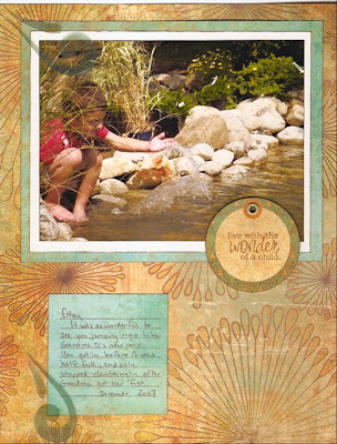
There’s more though. Have you gone back and looked at how LOAD has changed you? Or, perhaps to be more specific, how LOAD has changed your scrapbooking? I thought it might be interesting, and put together this slide show of most of my stuff. It’s not everything, not by a long shot, but it is a significant chunk. It’s interesting to see the evolution from my very simple first page, through Cathy Zielske’s Design Your Life and Everyone Can Write a Little classes, and Stacy Julian’s Library of Memories class, to my first of many LOAD challenges.

They’re all in there. Please forgive the length and the endlessly repeating piano loop. It was either that or banjos. That’s what I had to work with in iMovie.

You may want to go visit Danielle H. first, and then come back to watch this. The piano may put you to sleep.

Play Time At My House

I’m going to host my first open house/ scrap and stamp play time next Saturday, September 13 between 12 and 5pm. I’ll send out an email with details on how to get here. If you’re going to be in the area and I haven’t sent you an email, let me know. We’ll play with stamps and paper, maybe do a card or two. The first ten people who come will be able to make a little purse shaped card from this set of diecuts. If anyone has any techniques they want to experiment with, let me know, and I’ll make sure I have the materials ready. Otherwise, we’ll play with watercolor stamping techniques. Check out Tim Holtz’s blog for inspiration. I don’t claim to be as good as he is, but we can play with his techniques.

And for anyone interested, I’ve signed up for Cathy Zielske’s Design Your Life class, to pump up my design savvy. It starts October 3, and runs thru Christmas. I’m really looking forward to it. Anyone else want to take it?

Oh, and a word of warning for visitors next Saturday. I have 4 cats, a dog, two rambunctious boys and no offstreet parking. So, yes, kids are welcome. I’ll have a table set up with kid stamps and stickers, and number one son will be on entertainment duty. (Now he just has to keep his room picked up between now and then.)

Schemes/Plans/Blueprints/ Design planning

One of the things that makes my life easier when I’m putting together an album or mini-book that has a theme (ie vacation album, birthday album, baby book, favorite things, etc.) is to take the time to plan a layout that I can use repeatedly throughout the album. This can help unify an album, even if you don’t use the same colors or products from page to page. I don’t have to use the exact same layout on each spread, but can modify it as needed.
What exactly is a layout? Well, think of it as a blueprint for your page. Photos go here, different papers go there, an embellishment or two or three go here, and so on and so forth. For example, the pages I did for my niece can be summed up by this plan:

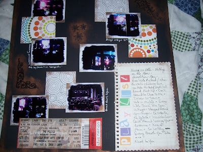
To do the second page, I simply rotated the plan 180 degrees, and replaced the title and journaling block with another photo.

The fun thing about approaching scrapbooking design this way is that you can find inspiration anywhere. A label on a piece of clothing that you like, an ad in a magazine that catches your eye, a piece of furniture with interesting lines are all places where you can find inspiration. Beautiful design is everywhere, you just have to be paying attention. Once you notice it, you can apply it to your own designs. Just remember the basic components: a focal photo, a title, and a place for you to write. Everything else is icing on the cake (or page, as the case may be.)

As one final note, I told you I was going to make a page about the Police concert I went to, and as threatened here it is:

I really like the way it came out, but you may not be able to see it very well. It does have a little structure, but this was a more organic process. This was more of a move everything around until it works page.

So, take a look around you, and look at the structure of things you like. Then go mimic it. It’ll be fun. Try it!

Quick and Easy Card

Materials:

Floral Favorites stamp set
Basic Birds stamp set
Juliette SWIC
Ultra Smooth White Cardstock
Juliette coordinating cardstock pack
Versamagic-perfect plumeria

Tools:

Paper trimmer
acrylic blocks for stamps
adhesive

Instructions:

1. Cut a sheet of white cardstock in half to measure 8 1/2 X 5 1/2. Fold in half to get a 4 1/4 X 5 1/2 card.
2. Cut a 4 1/4 strip of paper from the striped paper in the Juliette SWIC paper pack. Tear about a 2″ piece off. Adhere along top edge of white card.
3. Cut a 4 1/4 strip of paper from the light tan cardstock in the coordinating cardstock pack. Tear off a 3″ piece. Adhere along bottom edge of white card.
4. Ink oval flower from Floral Favorites set with versamagic perfect plumeria, and stamp on left over piece of white ultrasmooth cardstock. Trim to small rectangle. Rub ink pad along edge of rectangle to add hint of color. Adhere over joint between striped and tan papers.
5. Ink “enjoy” from Basic Birds with versamagic perfect plumeria, and stamp on small tag from Juliette SWIC. Adhere on bottom right-hand corner.
6. Rub ink pad along edges of card front to add color and definition.

Fill the inside with a favorite quote or a short note, then share. Repeat as needed.

Love this layout!

I had to do something with the photos I took of Josefine, and I had some lovely Heidi Grace papers I wanted to use. I’ve been looking for an excuse to use some Stampin Up Rub ons, and I found some alpha stickers that I hadn’t been able to come up with a use for before now. Fran, one of the women who also teaches at JoAnn’s kindly gave me the glitter stickers, which added just the right touch of glam. And the buttons were the final touch.
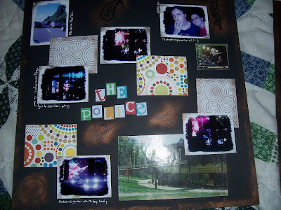
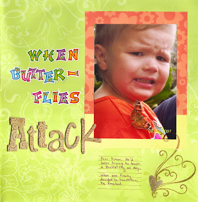
What do you think? I thought it came out nice. Oh, and the felt flowers and ribbons were from the dollar bins at Target. Yay Target! On a trying to be more thrifty (but not doing too well) note, I used a left over piece of cardstock to mat the picture on the left. This is the back. Jess and Jason might recognize the letters, since I used them on a Christmas gift for them 2 years ago. And yes, I do keep everything. I have a box full of baby food jars in the attic that I just know I’m going to find a use for someday, just wait and see.
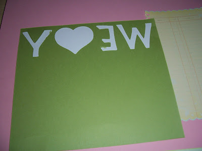
Page Review

I just thought I’d share with you one of the scrapbook layouts I’ve done. I’ll occasionally post more, when I think something I’ve done is interesting or pretty.
The letter stickers are some I’d gotten for the kids one time, but on seeing them again, realized they’d go perfectly with this picture. The “attack” letters are some of Tim Holtz’ grungeboard. I love his stuff. The stamps are from Close to my Heart. The stamps from CTMH are clear polymer, and are very sticky. They can be a little difficult to peel off the storage sheet. But they do have some nice designs. The papers are from DieCuts With a View. While I’m at it, I’ll post one of Ethan, too. Here:

Either Mom or I took this photo when she was having her pond installed. These are all Angel Company papers and stamps, and the transparent shapes are from Heidi Grace/Fiskars. I love this paper. I want about ten pieces of this exact paper, but I’d have to buy 10 sets to get that. And while all the papers and tags in the set are beautiful, they don’t make me say “I need you” like this particular design does. Oh well. Reason not to spend money.

Hope you like the pages 😀

I got lucky!

So I read a few different scrapbooking and stamping blogs, and sometimes the ones hosted by people with connections in the industry have giveaways. Sometimes the winners are chosen by the host, and sometimes they use random chance.

Tim Holtz had a giveaway last week of various Ranger products. I won a complete set of the distress inks. So completely cool and amazing. They arrived today. Look:
How cool is that? What do you think I should do first? I’m thinking grungeboard or chipboard. What do you think?

Does this make me a bad person?

So today’s been pretty rotten. I’m sick, I’m tired and grumpy, and I didn’t sleep well. (Okay who’s playing the world’s smallest violin? Louder now!)

The point is that I’m not dealing well with being a Mom today, ie telling my 3-year old to stop crying because it’s just a scrape on top of the scrape he got yesterday, and keep walking cos I can’t walk dog, and carry him and keep his big brother going too when I’m sick. It’s just pain! Suck it up and deal.

Anyway, after dinner we go outside and play with chalk on the sidewalk. The dog tries to eat some chalk, and in playing keep away, I notice the chalk leaves nice bright lines on his black coat. So I write DOG on both sides of Connor, and am beset by helpless giggles.

Does that make me a bad person?

Simple Layout

Last weekend I taught a 30 minute class to 30 seniors with some help from my mother. (aka SuperMom!) There were two basic ideas I tried to get across: You are your family’s historian, and scrapbooking is flexible. You can make it as simple or as ornate as you like.

The case in point: A very simple layout I used as a demo.

As you can see, it’s very simple. I’ll probably jazz it up later. It needs more pop. I brought in another layout I did not finish so I could show how a picture and papers could be rearranged to suit different ideas. For example:

As you can see these are little variations that give slightly different impressions to the page. Just a thought. Now go play with some paper. Or candlesticks. Or your garden tools. Rearrange until “happy.”

My First How-To for You!

No one signed up to make a perpetual calendar tonight (see the sidebar), so I’ll show you a simple project you can do with stamps tonight. This will work with any stamp. I’m using a very architectural stamp, but you could use an animal stamp if you’ve gone zoo crazy, or a Christmas stamp if you’re putting together holiday cards, or a ball stamp if you’ve got a kid whose second word was ball. You’ve got the idea.

A word about stamp pads

There are a lot of different inks. But when it comes to putting ink on your stamp there’s only one thing you need to know: is it a felt/cloth pad or a foam pad? If it’s a felt pad like the one on the left, you bring the stamp to the pad and tap it gently on the pad, then give it a little twist before lifting it off the pad. If it’s a foam pad like the one on the right, you turn your stamp upside down, and gently tap your pad on the stamp. No twisting! You can rip or separate the pad from it’s case if you aren’t gentle. If you follow these instructions, you can have stamp pads for years! They will need re-inking eventually, but that’s another easy thing to do. How to tell if a stamp pad is felt or foam? Get your fingers dirty! A felt pad feels like a piece of canvas, and a foam pad feels like, well, foam.

The Technique

We are going to make a background. I used this technique to make a card and a scrapbook page, but there are lots of other things you can do with this idea–even use paint and you have a home decor treatment that looks like wallpaper, without the need to scrape and peel in ten years when you decide you must have been crazy to do that. First you need to choose a stamp. Base this on what your end project is going to be. I knew I was going to be doing something with my husband in it, so I chose a stamp that could be considered masculine. (Maybe.) From this stamp set from theangelcompany (aka TAC). Then I chose three colors–2 colors close in hue, and then an accent color. I used Niagara Mist, Hint of Pesto, and Night Sky . (I’m linking you to Michael Trent’s website because I haven’t set one up for myself yet. He’s the wonderful guy who sent me a catalog from TAC for free! It’s his fault I’m selling TAC now.)

Start with the lighter of the two colors close in hue, and stamp in a staggered pattern, leaving room between images for the image in the darker color. If you aren’t comfortable with eyeballing it, stamp the image on a post it note, with as much of the image on the side with the sticky strip as possible. Cut close to the image, and you’ve got a repositionable place holder that you can use to help space your images. In StamperSpeak, it’s called a mask, and it’s a very useful trick for layering images, and creating scenes. That will be a future technique.
After you’ve filled the page with the lighter color, choose where you want your accent spot to be, and stamp the image once with the accent color. Then fill in all the empty spots with the darker background color. Don’t forget to go off the edge of your page. This will ground your background, and it won’t look like it’s just floating there, waiting for you to finish it.

I used it for a page about my husband on his birthday two years ago. I hope you like it.