No one signed up to make a perpetual calendar tonight (see the sidebar), so I’ll show you a simple project you can do with stamps tonight. This will work with any stamp. I’m using a very architectural stamp, but you could use an animal stamp if you’ve gone zoo crazy, or a Christmas stamp if you’re putting together holiday cards, or a ball stamp if you’ve got a kid whose second word was ball. You’ve got the idea.
A word about stamp pads
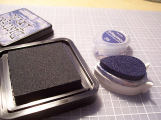 There are a lot of different inks. But when it comes to putting ink on your stamp there’s only one thing you need to know: is it a felt/cloth pad or a foam pad? If it’s a felt pad like the one on the left, you bring the stamp to the pad and tap it gently on the pad, then give it a little twist before lifting it off the pad. If it’s a foam pad like the one on the right, you turn your stamp upside down, and gently tap your pad on the stamp. No twisting! You can rip or separate the pad from it’s case if you aren’t gentle. If you follow these instructions, you can have stamp pads for years! They will need re-inking eventually, but that’s
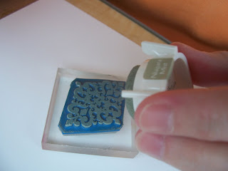 another easy thing to do. How to tell if a stamp pad is felt or foam? Get your fingers dirty! A felt pad feels like a piece of canvas, and a foam pad feels like, well, foam.
The Technique
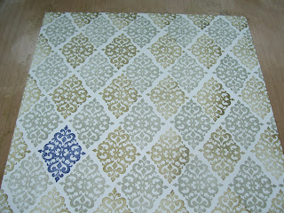
We are going to make a background. I used this technique to make a card and a scrapbook page, but there are lots of other things you can do with this idea–even use paint and you have a home decor treatment that looks like wallpaper, without the need to scrape and peel in ten years when you decide you must have been crazy to do that. First you need to choose a stamp. Base this on what your end project is going to be. I knew I was going to be doing something with my husband in it, so I chose a stamp that could be considered masculine. (Maybe.) From this stamp set from theangelcompany (aka TAC). Then I chose three colors–2 colors close in hue, and then an accent color. I used Niagara Mist, Hint of Pesto, and Night Sky . (I’m linking you to Michael Trent’s website because I haven’t set one up for myself yet. He’s the wonderful guy who sent me a catalog from TAC for free! It’s his fault I’m selling TAC now.)
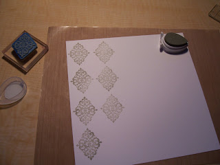 Start with the lighter of the two colors close in hue, and stamp in a staggered pattern, leaving room between images for the image in the darker color. If you aren’t comfortable with eyeballing it, stamp the image on a post it note, with as much of the image on the side with the sticky strip as possible. Cut close to the image, and you’ve got a repositionable place holder that you can use to help space your images. In StamperSpeak, it’s called a mask, and it’s a very useful trick for layering images, and creating scenes. That will be a future technique.
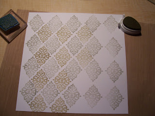 After you’ve filled the page with the lighter color, choose where you want your accent spot to be, and stamp the image once with the accent color. Then fill in all the empty spots with the darker background color. Don’t forget to go off the edge of your page. This will ground your background, and it won’t look like it’s just floating there, waiting for you to finish it.
I used it for a page about my husband on his birthday two years ago. I hope you like it.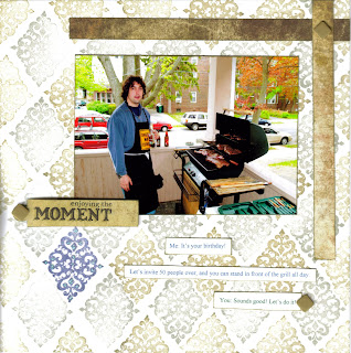

SECURITY CENTER: Look Please Here
Very nice! These background pages you make always look so perfect that I often forget the work that went into making them (I guess my brain just assumes they’re pre-made or something), so I appreciate the step-by-step.
See Please Here