As you may have heard, I’m taking an online class at Big Picture Scrapbooking from Cathy Zielske, who’s one of my all time favorite scrapbookers. I thought I’d share my layouts as we go along, and try to explain what I was trying for with each one. (And some legalese for you: Layout and concept provided by Cathy Zielske’s Design your Life workshop at BigPictureScrapbooking.com)
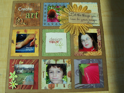 This was the layout assigned before class actually started. Cathy said to get it all out of our system, so I went project happy, and turned each square into a little canvas. (Not actually canvas, but the idea of each as a separate work.) I did alcohol ink techniques and stamped on the upper left, and stamped the fabric flower on the upper right. I added some of my favorite new products: grungeboard, stickles glitter glue, and those jewel like pebbles. I tried to use all scraps, or papers I hadn’t looked at in ages. I had fun. I even wrote on the photos the idea behind them. Create Art, Cherish Moments, Remember, Share Love, Find Beauty, and Be Me. That’s pretty much why I scrap. Any questions?
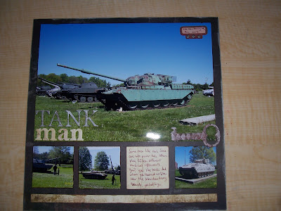 This is the first layout, where we’re working on the concept of balance. I chose papers and product with my hubby in mind. Masculine papers, distressed grungeboard, and tanks. What more could a Tank Man need?

This is the second assignment about symmetrical balance. It’s purpose was to be more about the time that my brother and BIL spend with my eldest, rather than about play sword fighting. He adores his uncles, and they get that he’d rather play with them than have expensive presents (although presents are cool too.)

This last assignment for the week was a real world color challenge. We were to try using colors from something in the real world, in this case an ad for a cool modern rug. This one was easy. I had the colors on hand. The one for this week is hard: Orange and pink and brown. I’m not much of a pink person, in case you didn’t know.
Well, I hope you enjoyed these. If you ever get a chance to take a class from Cathy Zielske, do it! She rocks!
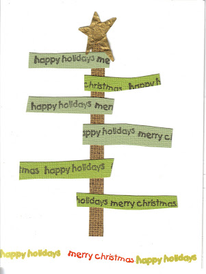
 They’re from ideas I’ve gotten from various catalogs and things. I’ll have more ideas we can play with by the 8th.
 back:
back: And that’s all I’ve got for today. Hope your day was a good one.

 This was the layout assigned before class actually started. Cathy said to get it all out of our system, so I went project happy, and turned each square into a little canvas. (Not actually canvas, but the idea of each as a separate work.) I did alcohol ink techniques and stamped on the upper left, and stamped the fabric flower on the upper right. I added some of my favorite new products: grungeboard, stickles glitter glue, and those jewel like pebbles. I tried to use all scraps, or papers I hadn’t looked at in ages. I had fun. I even wrote on the photos the idea behind them. Create Art, Cherish Moments, Remember, Share Love, Find Beauty, and Be Me. That’s pretty much why I scrap. Any questions?
 This is the first layout, where we’re working on the concept of balance. I chose papers and product with my hubby in mind. Masculine papers, distressed grungeboard, and tanks. What more could a Tank Man need?

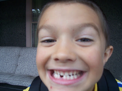
 I have seen that expression on my oldest’s face so many times. This may be where he gets it from. He is a pretty handsome boy:
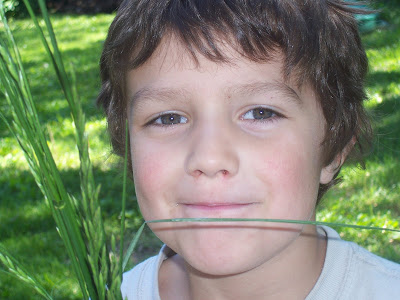 But sometimes he just doesn’t want me to take any more pictures: