Monthly Archives: August 2008

Schemes/Plans/Blueprints/ Design planning

One of the things that makes my life easier when I’m putting together an album or mini-book that has a theme (ie vacation album, birthday album, baby book, favorite things, etc.) is to take the time to plan a layout that I can use repeatedly throughout the album. This can help unify an album, even if you don’t use the same colors or products from page to page. I don’t have to use the exact same layout on each spread, but can modify it as needed.
What exactly is a layout? Well, think of it as a blueprint for your page. Photos go here, different papers go there, an embellishment or two or three go here, and so on and so forth. For example, the pages I did for my niece can be summed up by this plan:

To do the second page, I simply rotated the plan 180 degrees, and replaced the title and journaling block with another photo.

The fun thing about approaching scrapbooking design this way is that you can find inspiration anywhere. A label on a piece of clothing that you like, an ad in a magazine that catches your eye, a piece of furniture with interesting lines are all places where you can find inspiration. Beautiful design is everywhere, you just have to be paying attention. Once you notice it, you can apply it to your own designs. Just remember the basic components: a focal photo, a title, and a place for you to write. Everything else is icing on the cake (or page, as the case may be.)

As one final note, I told you I was going to make a page about the Police concert I went to, and as threatened here it is:
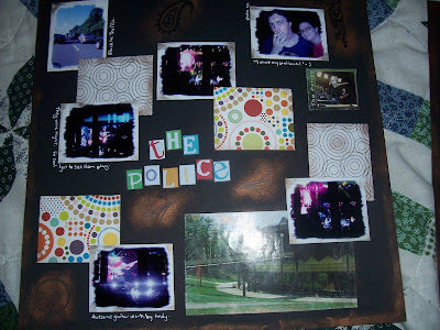
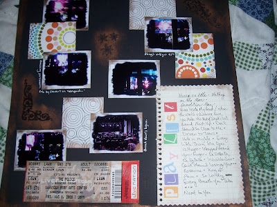
I really like the way it came out, but you may not be able to see it very well. It does have a little structure, but this was a more organic process. This was more of a move everything around until it works page.

So, take a look around you, and look at the structure of things you like. Then go mimic it. It’ll be fun. Try it!

Point and Shoot Beauty

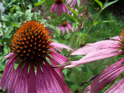
I just wanted to share a few photos I’ve managed to take with the macro option on my little point and shoot camera.

Hibiscus:

Echinacea: Hydrangea:
Hydrangea again:
Black Eyed Susan:
Not bad for a point and shoot, don’tcha think? I haven’t even photoshopped them (yet).

Waking Simon (a vignette)

After getting out of the shower, I found Simon had crawled back in bed with Jonathan and had fallen asleep. I had to document the cuteness.

I love my baby.

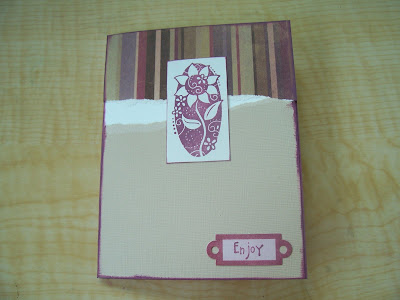
Quick and Easy Card

Materials:

Floral Favorites stamp set
Basic Birds stamp set
Juliette SWIC
Ultra Smooth White Cardstock
Juliette coordinating cardstock pack
Versamagic-perfect plumeria

Tools:

Paper trimmer
acrylic blocks for stamps
adhesive

Instructions:

1. Cut a sheet of white cardstock in half to measure 8 1/2 X 5 1/2. Fold in half to get a 4 1/4 X 5 1/2 card.
2. Cut a 4 1/4 strip of paper from the striped paper in the Juliette SWIC paper pack. Tear about a 2″ piece off. Adhere along top edge of white card.
3. Cut a 4 1/4 strip of paper from the light tan cardstock in the coordinating cardstock pack. Tear off a 3″ piece. Adhere along bottom edge of white card.
4. Ink oval flower from Floral Favorites set with versamagic perfect plumeria, and stamp on left over piece of white ultrasmooth cardstock. Trim to small rectangle. Rub ink pad along edge of rectangle to add hint of color. Adhere over joint between striped and tan papers.
5. Ink “enjoy” from Basic Birds with versamagic perfect plumeria, and stamp on small tag from Juliette SWIC. Adhere on bottom right-hand corner.
6. Rub ink pad along edges of card front to add color and definition.

Fill the inside with a favorite quote or a short note, then share. Repeat as needed.

The Police Rock!

Hubby and I went to see the Police last night at SPAC. It’s the last week of their reunion tour, and I’m so glad I was able to see them. They’re playing one night in New Jersey, then 2 nights at Jones Beach, then finishing out at Madison Square Garden on Thursday. If you can manage to get tickets, go! Unless you despise them. Then you probably wouldn’t enjoy yourself.

As proof that we were there, and that I shouldn’t quit my day job to become a concert photographer I offer:

I know these are just awful pics, but I’m still going to use them on a layout. I’m crazy like that.