One of the things that makes my life easier when I’m putting together an album or mini-book that has a theme (ie vacation album, birthday album, baby book, favorite things, etc.) is to take the time to plan a layout that I can use repeatedly throughout the album. This can help unify an album, even if you don’t use the same colors or products from page to page. I don’t have to use the exact same layout on each spread, but can modify it as needed.
What exactly is a layout? Well, think of it as a blueprint for your page. Photos go here, different papers go there, an embellishment or two or three go here, and so on and so forth. For example, the pages I did for my niece can be summed up by this plan:
 To do the second page, I simply rotated the plan 180 degrees, and replaced the title and journaling block with another photo.
The fun thing about approaching scrapbooking design this way is that you can find inspiration anywhere. A label on a piece of clothing that you like, an ad in a magazine that catches your eye, a piece of furniture with interesting lines are all places where you can find inspiration. Beautiful design is everywhere, you just have to be paying attention. Once you notice it, you can apply it to your own designs. Just remember the basic components: a focal photo, a title, and a place for you to write. Everything else is icing on the cake (or page, as the case may be.)
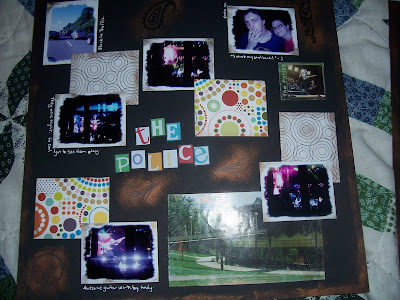
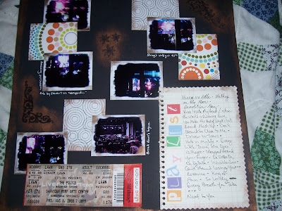
As one final note, I told you I was going to make a page about the Police concert I went to, and as threatened here it is:


I really like the way it came out, but you may not be able to see it very well. It does have a little structure, but this was a more organic process. This was more of a move everything around until it works page.
So, take a look around you, and look at the structure of things you like. Then go mimic it. It’ll be fun. Try it!


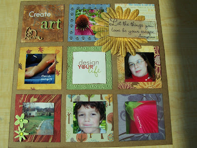 This was the layout assigned before class actually started. Cathy said to get it all out of our system, so I went project happy, and turned each square into a little canvas. (Not actually canvas, but the idea of each as a separate work.) I did alcohol ink techniques and stamped on the upper left, and stamped the fabric flower on the upper right. I added some of my favorite new products: grungeboard, stickles glitter glue, and those jewel like pebbles. I tried to use all scraps, or papers I hadn’t looked at in ages. I had fun. I even wrote on the photos the idea behind them. Create Art, Cherish Moments, Remember, Share Love, Find Beauty, and Be Me. That’s pretty much why I scrap. Any questions?
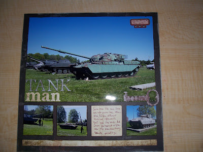 This is the first layout, where we’re working on the concept of balance. I chose papers and product with my hubby in mind. Masculine papers, distressed grungeboard, and tanks. What more could a Tank Man need?

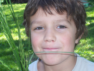
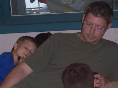
 I have seen that expression on my oldest’s face so many times. This may be where he gets it from. He is a pretty handsome boy:
 But sometimes he just doesn’t want me to take any more pictures:
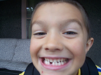
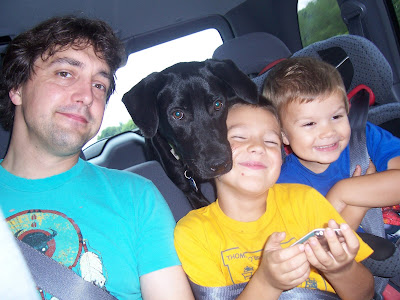

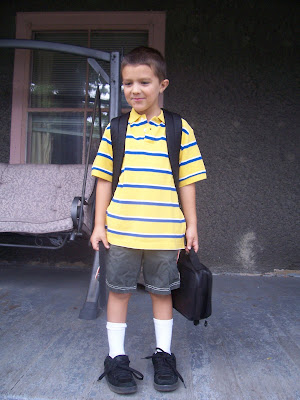
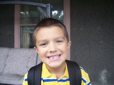 And yes, he just lost his first tooth. He was very excited about it. The tooth fairy paid him a visit, and left him with a 50 cent piece. I’m dreading the possibility that he will loose his teeth the same way he got them: all at once. He literally went from no teeth to 5 teeth within the space of about a week. At nine months old. Immediately after minor surgery. On a holiday weekend. It was fun.
 To do the second page, I simply rotated the plan 180 degrees, and replaced the title and journaling block with another photo.